CategoryContent and search
Link previews: what people see when they share a page
When someone pastes a page’s address into LinkedIn or WhatsApp, the platform visits that page and builds a card with a title, a description and an image. That data comes from og: tags in the <head>, part of the Open Graph standard (ogp.me). I cover how to write the title and description in the post on page titles and descriptions. This one is about the rest of the card: which tags exist, which image to use and why a fix sometimes doesn’t show up.
Which tags the card reads
The Open Graph protocol asks for four properties on every page (ogp.me):
og:title, the title as it should appear on the card;og:type, the kind of content, such asarticlefor a blog post;og:image, the address of the image that represents the page;og:url, the canonical address, which works as the page’s permanent identity.
The description, og:description, sits on the list of recommended optional properties, at one or two sentences. That same list includes og:locale, which states the language, and og:site_name, the site name shown on the card.
The image takes its own details, like type, width and height. The protocol also says any page with og:image should have og:image:alt, a description of what the image shows (ogp.me).
What LinkedIn requires
LinkedIn’s help center lists four tags that must be on the page: title, image, description and URL (LinkedIn Help, Make your website shareable). For the card image, these are the numbers:
- at least 1200 by 627 pixels;
- a recommended ratio of 1.91 to 1;
- a file of up to 5 MB.
The same article warns that images under 401 pixels wide show up as a thumbnail, small next to the title. It also gives the likely cause when an image meets every rule and still doesn’t appear: the site blocks LinkedIn from reaching the file, or the file sits in a protected folder (LinkedIn Help).
What Google asks of the same image
Google reads og:image too. It’s one of the ways to point to a page’s preferred image, alongside structured data (Google, Image SEO best practices). The guidance for that choice fits in a list:
- the image should be relevant and represent the page;
- it shouldn’t be generic, like the site logo;
- it shouldn’t contain text;
- it should avoid extreme ratios, too narrow or too wide;
- it should be high resolution, when possible.
Discover, Google’s feed of reading suggestions, has a stricter yardstick (Google, Get on Discover). It asks for images at least 1200 pixels wide, more than 300,000 pixels in total and a 16:9 ratio. The page also has to allow the large image with the max-image-preview:large setting. Since Google crops the image on its own, whatever matters in it has to survive the crop.
A small image still has to say something
In a feed, the card competes with everything around it, and the image often shows up small. The Nielsen Norman Group, or NN/g, says the image next to a link should describe and represent the page’s content. The same article calls out sites that pick generic images only loosely tied to the subject (Raluca Budiu, NN/g, 2020).
At a reduced size, detail disappears. In a 2013 article about sidebars, NN/g reports that in its eyetracking research, simple images with clean backgrounds and easy to recognize objects drew more attention than busy ones (Hoa Loranger, NN/g). When people can’t make out an image quickly, they skip the whole block of content around it.
A 2015 piece on list thumbnails on mobile offers a simple test (Aurora Harley, NN/g). Ask whether someone could choose using only the image. If it’s too small to show what matters, or it’s a generic stock photo, it isn’t helping.
Why the old preview won’t go away
The platform stores the card after it reads the address. According to LinkedIn’s help center, if the link was shared before, the preview window may show the old image, which got cached (LinkedIn Help, Post Inspector). To force a fresh read, paste the address into Post Inspector and check the card it returns.
That fix has a limit. It only applies to new posts with that link. Posts that are already out keep the old preview (LinkedIn Help).
How I did it on kahue.net
Every page on the site declares the protocol’s four tags plus the description. The language goes in og:locale, and the site’s other two languages go in og:locale:alternate. The image uses a full address, domain included, because the file is served from the site root and not from each page’s path. The image type, width and height are declared as well.
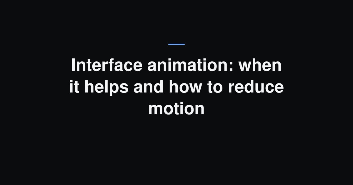
Each post has three covers, one per language, at 1200 by 630 pixels. A script reads the title from the post itself to draw the cover, so the Spanish version never carries the Portuguese title. The title sits in the center on purpose, because the blog index crops the cover to 4:3 and cuts off the sides. The 1200 by 630 size clears LinkedIn’s minimum and lands a hair away from the 1.91 to 1 ratio (LinkedIn Help).
The file format changed along the way. As PNG, a cover reached 720 KB, and I left a note in the code that this weight slowed down previews on WhatsApp and X. Converted to JPEG at quality 86, they dropped below 110 KB. The covers for this post are between 20 and 30 KB.
There’s also a script to run after the build, which opens each generated page and fails anything that breaks the rules. It checks that the image exists, that it measures 1200 by 630, that the type is article on posts and that the card’s language matches the page’s. Right now it’s out of date. It expects en on English pages, but the site uses en_US, the language and country format the protocol asks for (ogp.me), so it fails pages that are actually correct.
Compared with the sources, three things are still missing:
og:image:alt, the image description the protocol asks for;og:site_name, the site name on the card;max-image-preview:large, the setting Discover asks for to use the large image.
Where the sources disagree
The first difference is what counts as required. Open Graph requires og:type and leaves the description optional (ogp.me). LinkedIn requires the description and doesn’t mention the type (LinkedIn Help). Declaring all five tags covers both.
The second is the image shape. LinkedIn recommends 1.91 to 1, and Discover asks for 16:9, a slightly taller rectangle (Google, Discover). A single file can’t hit both. A 1200 by 630 cover follows LinkedIn and lets Discover trim the sides, which works here because the text is in the middle.
The third hits kahue.net head on. Google asks for an og:image without text (Google), and the blog covers are exactly the title written on a dark background. For LinkedIn, which only talks about size and weight, they’re fine. For Google, the advice points to an image that shows the subject instead of spelling out its name. For now, the covers stay as they are.
How to check before you share
- Open the page source and look for the
og:tags. Make sure the title, description and image belong to this page and not to the home page. - Open the image address in a private window. If it asks for a login, the card won’t show it.
- Paste the link into Post Inspector and look at the card LinkedIn builds.
- Changed the title or cover after publishing? Run the link through the inspector again before posting it a second time.
- Picture the cover with its sides cut off. Whatever matters needs to be in the middle.
Sources
- Open Graph protocol
- LinkedIn Help, Make your website shareable on LinkedIn
- LinkedIn Help, Use Post Inspector to refresh URL
- LinkedIn, Post Inspector
- Google, Image SEO Best Practices
- Google, Get on Discover
- Nielsen Norman Group, Information Scent: How Users Decide Where to Go Next
- Nielsen Norman Group, Fight Against “Right-Rail Blindness”
- Nielsen Norman Group, List Thumbnails on Mobile: When to Use Them and Where to Place Them