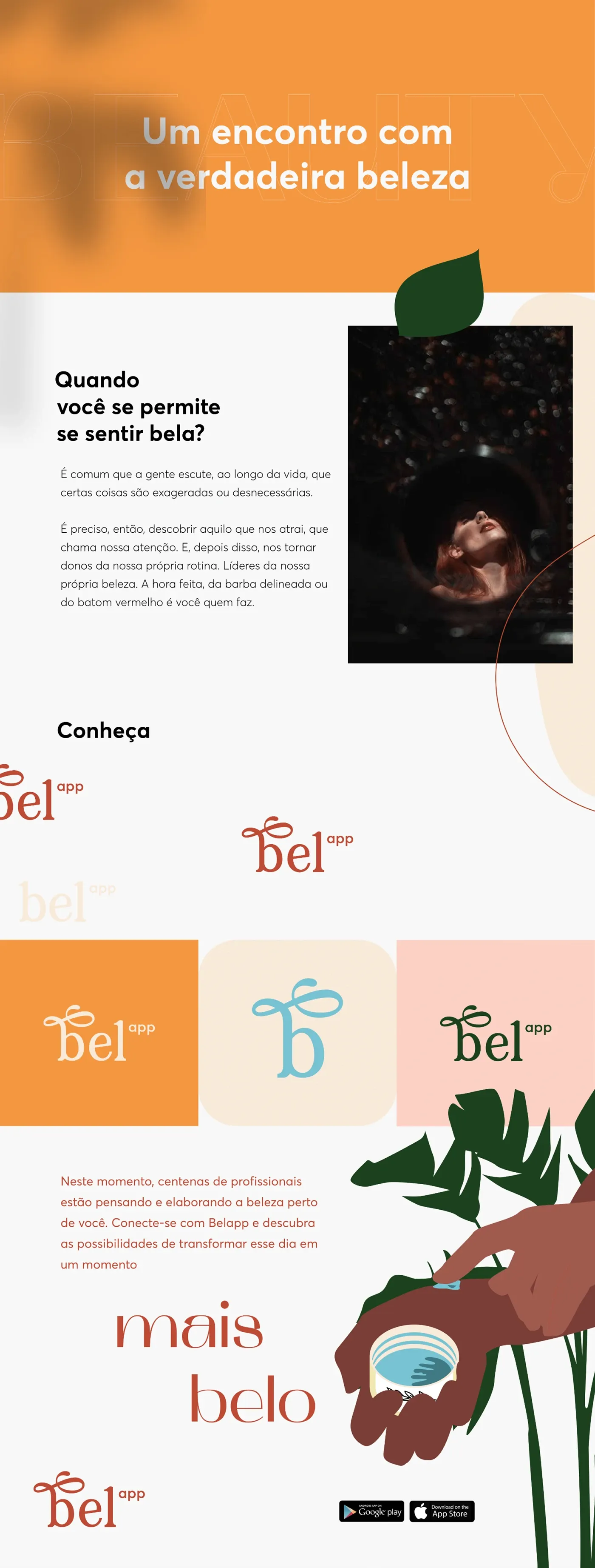
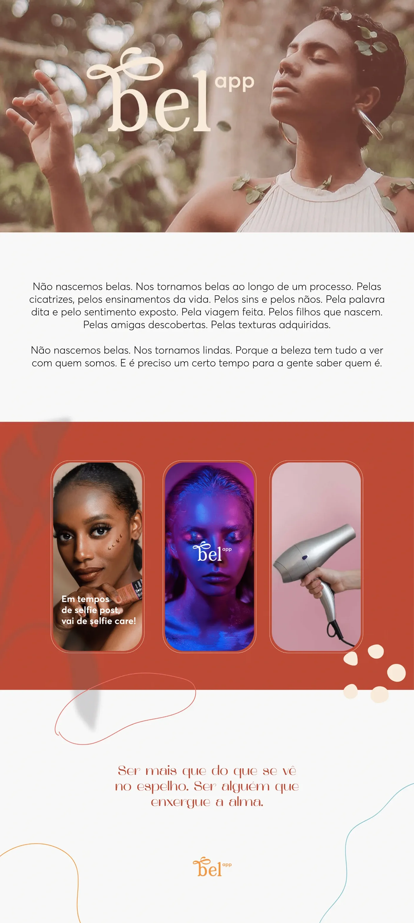
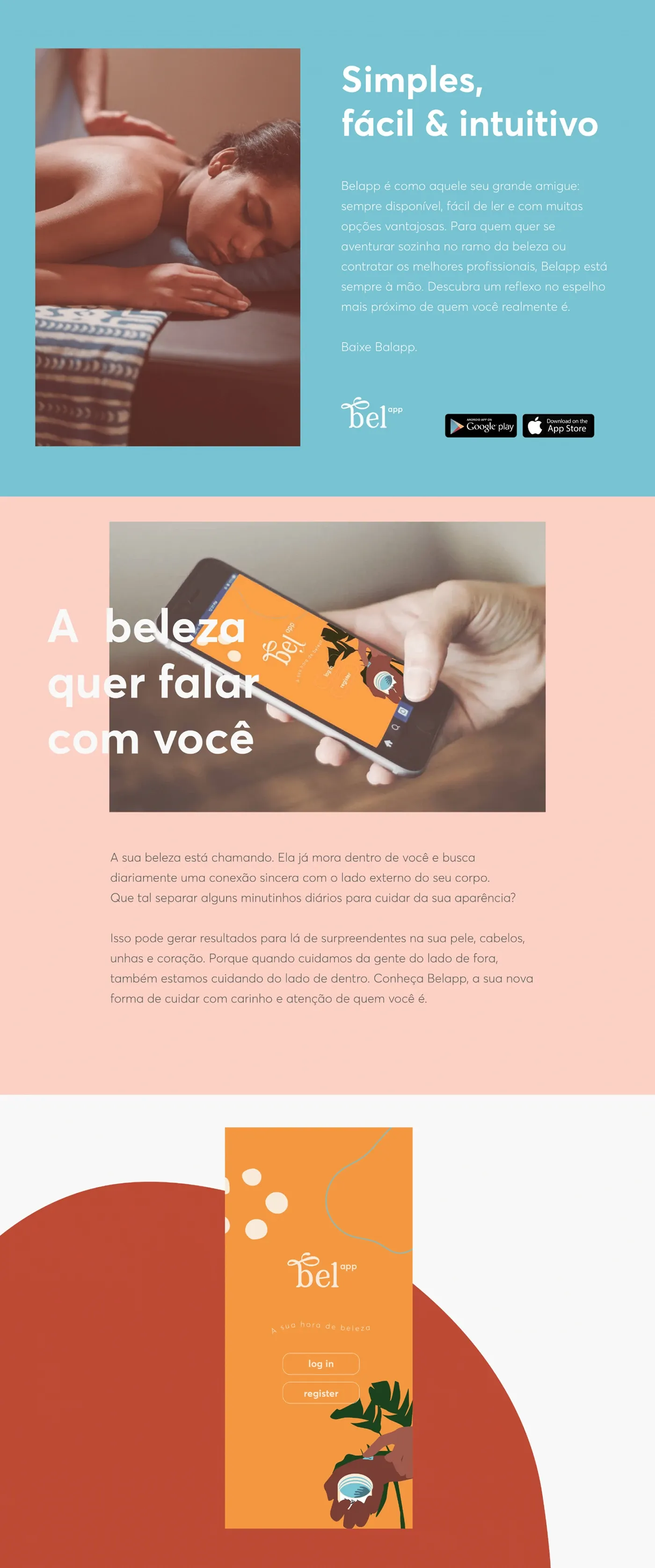
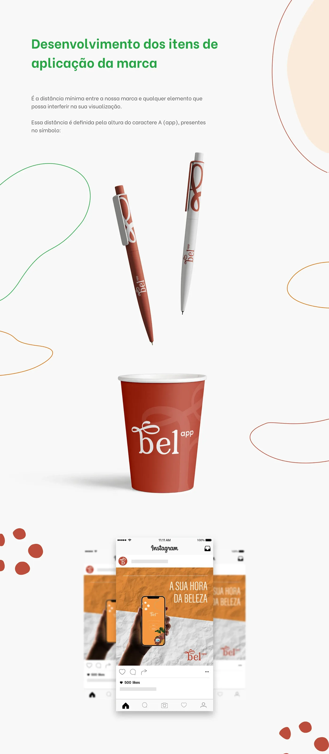
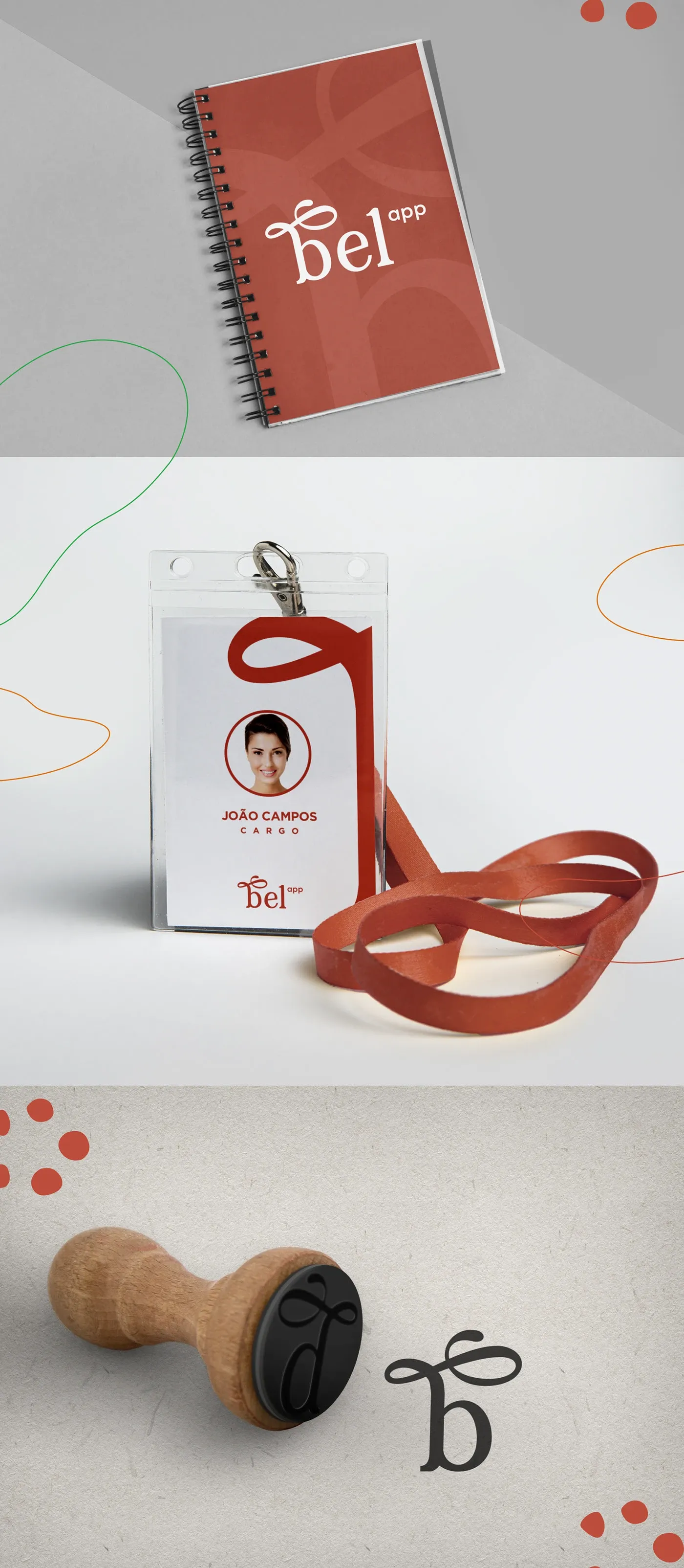
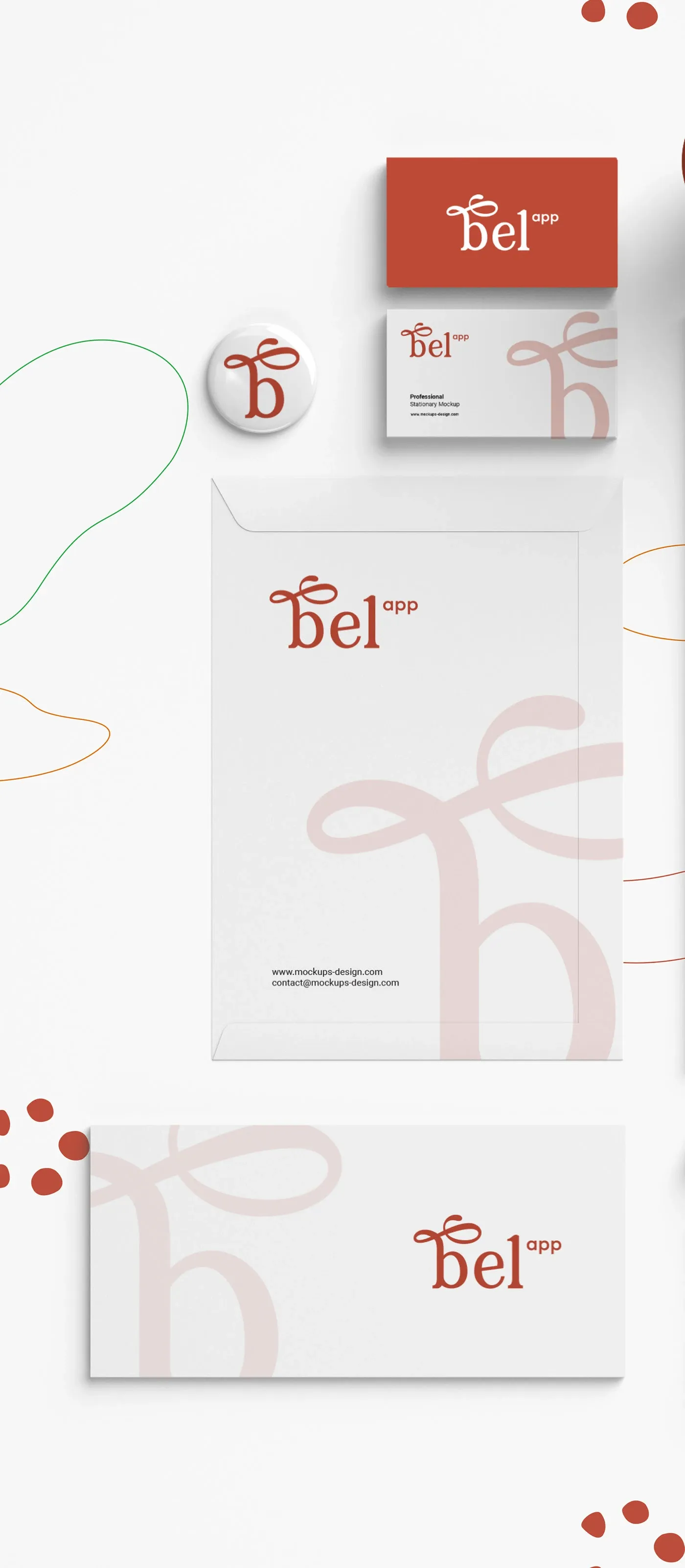
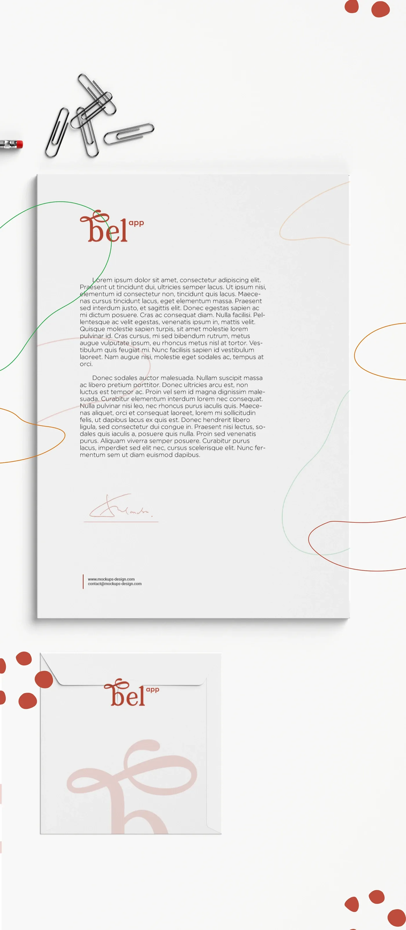
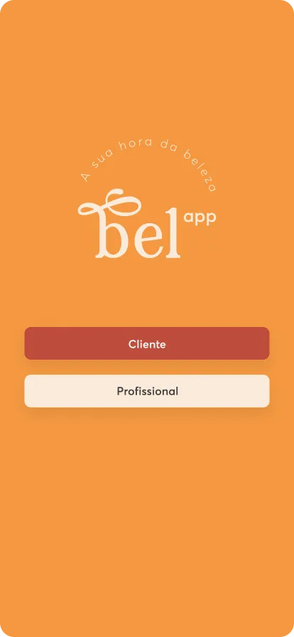
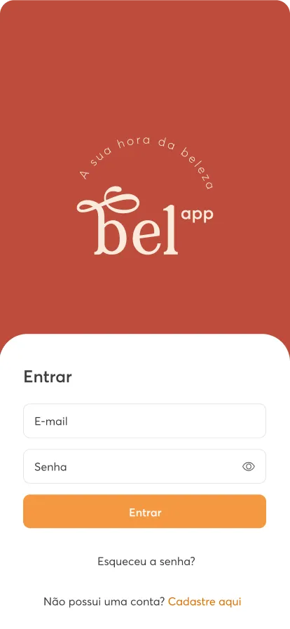
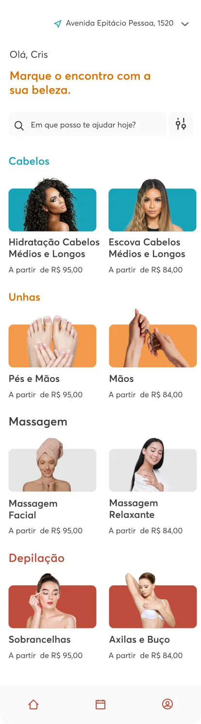
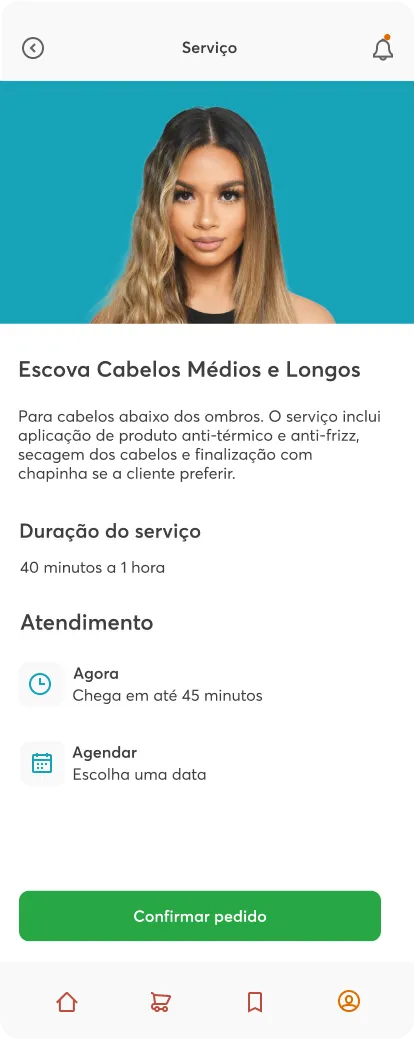
bel app is a beauty and self-care product, and the case is its visual identity: the manifesto copy, the photography direction, the logo lockups and the colour system that carries them.
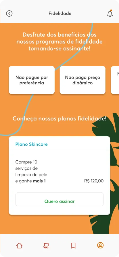
The palette is warm and muted, terracotta, burnt orange, cream, blush, soft blue and deep green, applied through a lowercase wordmark whose b forms a ribbon loop. The identity was built to work across product surfaces and marketing pieces alike.
What I did
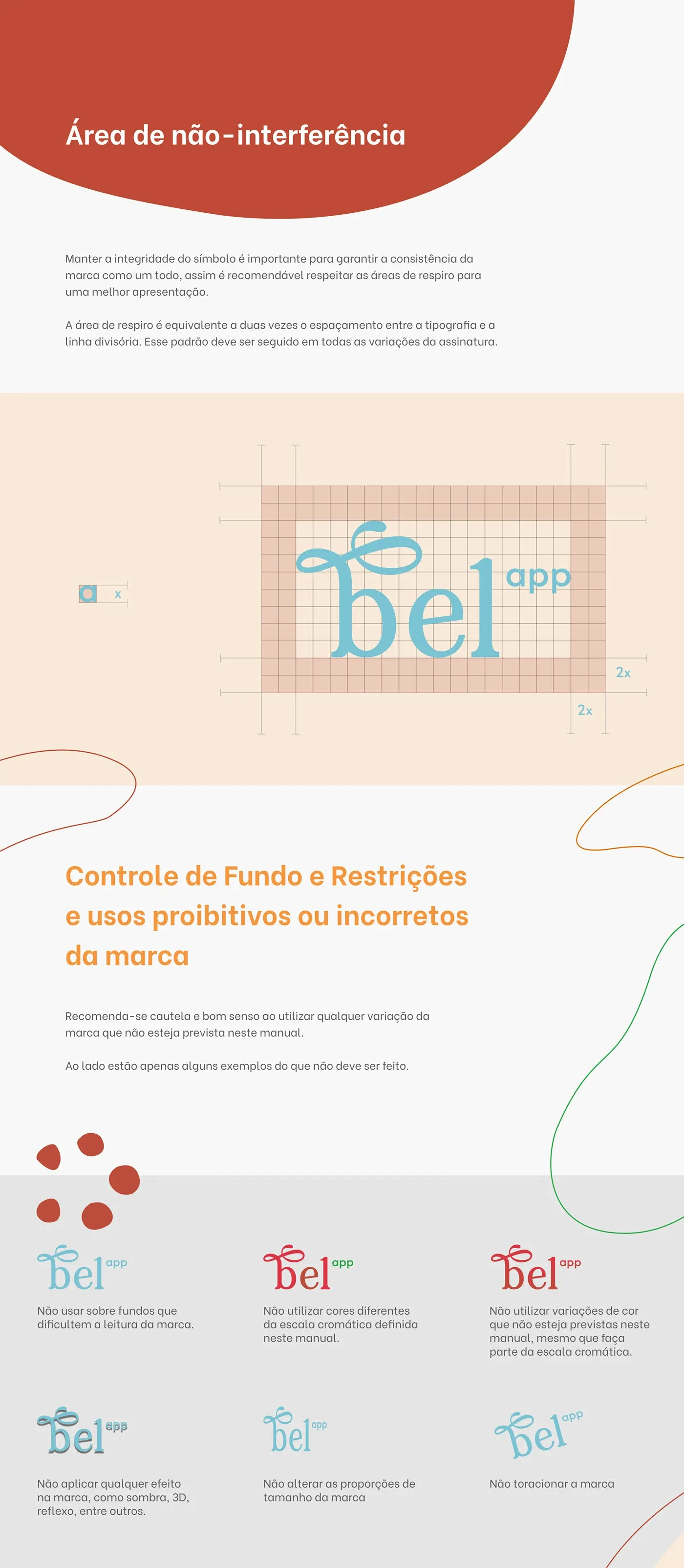
- Designed the logo and its lockup variants for different surfaces and backgrounds.
- Built the colour system and tested it through the mark itself.
- Set the photography and typography direction for the brand.